Dataiku US census analysis
(Alexandre CORTYL - Apr 2, 2016)
This report was produced as part of the interview process at Dataiku: https://www.dataiku.com/
Introduction:
I will detail the steps I followed to solve the problematic, and present my analysis methodology. It should be read along with the associated R script that aims to process the "US Census Data" containing information about around 300,000 people. After having analyzed the data, the objective is to accurately predict if an individual saves more or less than $50,000 per year, from the given attributes.
Before jumping into the analysis, I spent some time exploring the raw data, and tried to better understand the different attributes and instances, that would later help predict whether an individual earns more or less than $50,000 a year. In particular, I did some research to understand the meaning of “Not in universe” values: they indicate that this attribute is not relevant for this particular individual (the universe is the population at risk of having a response for the variable in question).
Data preparation
I started by doing a quick exploration of the provided data set. First of all, I displayed a quick summary of all columns using summary(train_set), to have an overview of the data types, the data distribution etc.
I looked for possible correlations with:
numeric_attributes <- sapply(train_set, is.numeric)
cor(train_set[, numeric_attributes])
I also detected (with the box-and-whiskers method) and removed outliers if they seemed to be errors. Because there were a lot of data attributes on which I had little knowledge, I decided not to do any inconsistency check. Below, I will detail some of the main points revealed by my approach.
The first task was to reduce the number of predictors. There are 41 potential explanatory attributes, but I decided to only keep the ones that are relevant, in order to later simplify the predictive model and boost its performances by removing noisy data. The following table summarizes the observations and actions I took for each column. Overall, I chose to remove columns that don’t provide additional information:
| Columns | Observation | Action |
|---|---|---|
| INSTANCE_WEIGHT | Information about proportion of the population is not relevant | Deleted column |
| CHANGE_IN_MSA, CHANGE_IN_REGION, MOVE_WITHIN_REGION, SAME_HOUSE_1_YEAR_AGO and PREVIOUS_RESIDENCE_SUNBELT | Half of the records don't have any value for those attributes => information provided by those is limited | Deleted columns |
| VETERAN_FORM | Less than 1% of the training set is concerned (99% of "Not in universe"), and I observed that it doesn't affect the class to predict | Deleted column |
| PREVIOUS_RESIDENCE_REGION, PREVIOUS_RESIDENCE_STATE, LABOR_UNION_MEMBER and YEAR | Plotted distribution of the class depending on those: they have very little effect on the class we’re looking to predict => not significant for our classification | Deleted columns |
| UNEMPLOYMENT_REASON | Not relevant to identify people who save more or less than $50k per year, as we can rely on the EMPLOYMENT_STATUS to distinguish those who are unemployed | Deleted column |
| HOUSEHOLD_STATUS | To avoid redundant information, we decide to keep the HOUSEHOLD_SUMMARY column as it is a simplified version of HOUSEHOLD_STATUS whilst keeping the best way to distinguish 50k | Deleted column |
| FATHER_BIRTH_COUNTRY, MOTHER_BIRTH_COUNTRY and BIRTH_COUNTRY | These are highly correlated with CITIZENSHIP, so we choose to keep this last one to simplify our model | Deleted columns |
| HISPANIC_ORIGIN | This information is of little interest considering that the “RACE” attribute has the predominant effect on the class category | Delete column |
| INDUSTRY_CODE and OCCUPATION_CODE | We prefer to keep the MAJOR_INDUSTRY and MAJOR_OCCUPATION columns for sake of simplicity, as they appear to better correlate with the revenue class | Deleted columns |
Next, I decided to remove all elements with missing values (NAs). But I kept duplicate rows that result from the removal of several columns, that still indicate the weight and frequency of the information (that wasn’t duplicate prior to the attribute selection).
Overall, we can also observe that the distribution of the classes is not at all even: only 6% of the training set is composed of inputs of class “50000+.” Our model will only have a few examples from which to learn to recognize this class.
Thanks to all of these data pre-processing steps, I was able to reduce the number of attributes from 41 to 21, which will considerably simplify the building of a predictive model!
Data visualization
After I was done with the data preparation, I focused on producing simple but effective visual representation of the data. My goal was to highlight which feature had the biggest impact on the final class of an individual, by displaying the class repartition for the main attributes. Because some attributes had a lot of possible value, I kept the main ones when required. To do so, I kept those who had a frequency difference between classes superior to a threshold = 15%
Age vs Income
We start by plotting the number of entities depending on the age:
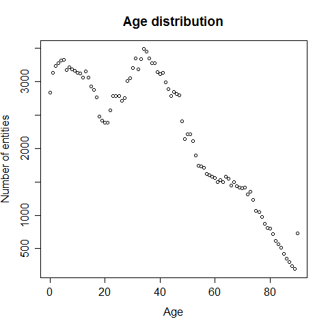
The ages range from 0 to 90 years old with the majority of entries between the ages of 0 to 20 and 30 to 50. I wasn't sure if the entries aged 0 where errors or not, but because there were so many (2839) I decided to keep them. Now let’s go into more detail and look for the class distribution depending on age categories, because there are so many ages being represented: The age segmentation was done as follows:
- Young (<20)
- Active (20-60)
- Senior (>60)
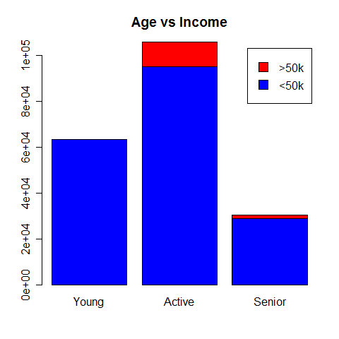
Looking at the graph, we can see that there is a significant amount of variance between the ratio of >50k to <50k between the age groups. In particular, it appears that there is almost no chance of having an income greater than $50k if you are bellow 20 years old. People in the “active” category seem to earn the most.
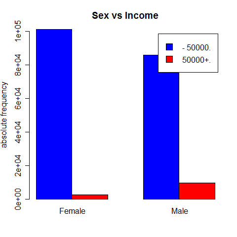
Sex vs Income
It is interesting to see the class distribution depending on the sex: apparently, men tend to earn more than women.
Work category vs Income
Working in the private sector looks like the most lucrative option.
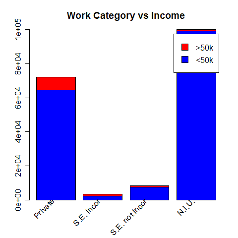
The main work represented here are "Private", "Self-employed incorporated" (S.E. incor), "Self-employed not incorporated" (S.E. not incor) and "Not In Universe" (N.I.U). We observe that although most of those earning more than $50k per year work in the "Private" sector, it is in the "Self-employed incorporated" category that has the biggest ratio of high earners (34%).
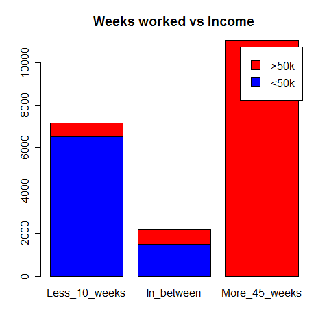
Weeks worked vs Income
Here again, because there were a large number of different values, I grouped them into three categories just like I did when comparing Age with Income. Unsurprisingly, the more you work, the more you earn. That seems to be an important criteria as we can clearly see the large dominance of people winning more than 50k in the group of those working more than 45 weeks per year.
Education vs Income
Education seems to correlate with high salary.
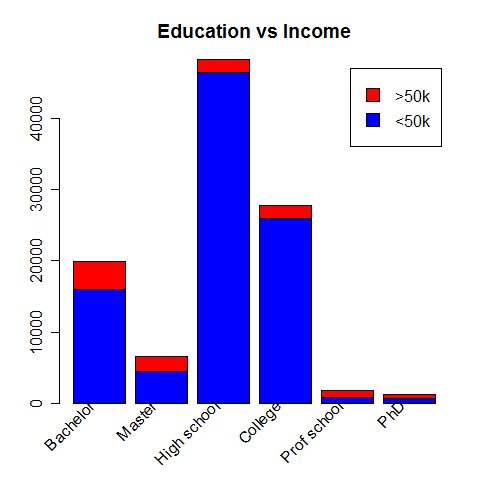
Most of the high-earners have a bachelor but the proportion of them is the highest within the "Prof school" category (55%).
Race vs Income
An individual’s “race” also seems to have an impact on his annual savings, although it must more likely be the indirect consequence of education and social status.
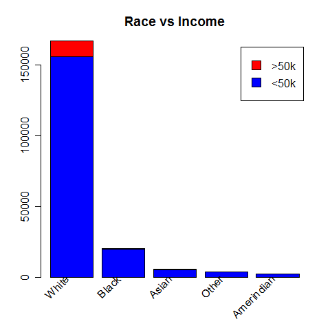
The very large majority of high-earners are labelled as in the "White" category.
All of these steps were in my opinion crucial to producing a good analysis, because studying a data set will make more sense if you actually know what you’re looking at. From this quick statistical analysis, we can observe that the best way to earn more than $50,000 per year seems to be a white married male in his 40s, working 52 weeks per year in the private sector, with a good level of education and a “joint both under 65” tax filler status.
Predictive model
I chose to test a simple decision tree versus a linear regression model.
General Additive Model (GLM)
I trained a GLM on the previously cleaned training data, using all remaining attributes.
The summary(glm_model) allows us to identify significant variables, being the ones with low p-values.
After the training, we can compute the following confusion matrix:
| glm_pred | -50000 | 50000+ |
|---|---|---|
| <50k | 185308 | 7717 |
| >50k | 1833 | 4665 |
This matrix must be read as follows : our GLM model has correctly predicted 185308 "50k", but wrongly classified 7717 "50k".
From this, we can deduct the prediction accuracy: (185308 + 4665)/(185308 + 4665 + 1833 + 7717) = 95.2%
We must also point out that our GLM model is relatively precise when it comes to predicting "50k" class (4665/(4665 + 7717) = 37.7%).
To summarize:
- prective accuracy = 95.2%
- predictive accuracy of "<50k" = 99%
- predictive accuracy of ">50k" = 37.7%
However, although this result may help us compare the two models, we must remember that it is strongly subject to overfitting, as we evaluate the model on the same set of data on which it was previously trained!
Simple decision tree
We then create a simple decision tree. As we produce this tree with default parameters (no reducing of mindev to allow more leaves latter pruned for example), we get a very simple tree (9 leaves) with an implicite selection of attributes on which to classify the data (MAJOR_OCCUPATION, TAX_STATUS, EDUCATION, CAPITAL_GAINS, SEX and AGE).
We get the corresponding confusion matrix:
| tree_pred | -50000 | 50000+ |
|---|---|---|
| <50k | 186912 | 11076 |
| >50k | 229 | 1306 |
This provides the following results:
- predictive accuracy = 94.3%
- predictive accuracy of "<50k" = 99.8%
- predictive accuracy of ">50k" = 10.5%
This results are worst then the ones obtained with the GLM model. Just like for the previous results, we must keep in mind that they are most certainly subject to overfitting.
After training both of these models using the training set, I chose to keep the GLM model as the most accurate.
Predictive model evaluation
Finally, I was able to evaluate this GLM model on the test set. By repeating the previous methodology, this time on the training data set to avoid overfitting, we can focus on the following confusion matrix:
| glm_pred | -50000 | 50000+ |
|---|---|---|
| <50k | 92665 | 3841 |
| >50k | 911 | 2345 |
I obtained an overall predictive accuracy of 95.2%:
- prective accuracy = 95.2%
- predictive accuracy of "<50k" = 99%
- predictive accuracy of ">50k" = 37.9%
The accuracy are roughly the same, but we can spot a little improvement on the prediction of the ">50k" class, which is a good thing!
To finish, we must not forget that the “simplest” possible model that would always predict that an input is saving less than $50k per year (as it is the dominant class) would have had an accuracy of 93,8% on this test set (There are only 6186 entities which save more than $50k a year, out of 99762 total records).
Comparing the two, I can be satisfied with the result of my solution, which performs a little better.
Conclusion
This technical test taking part in Dataiku’s recruitment process was a very interesting exercise. I enjoyed working on such a task, and hope I was able to demonstrate my analytical skills and my motivation.
I was particularly challenged by the data cleaning step. Indeed, I’m used to having clean data sets provided in school courses where the objective is to focus on the analysis rather than on the data cleaning, although I’m aware that in the real world things aren’t that easy. Therefore, I had to use the knowledge I acquired when I followed online MOOCs (Data Science Specialization by the Johns Hopkins University for example) to perform this step.
Overall, I think my script could be simplified with additional factorization (declare functions instead of repeating code). The global execution of the script can also be considered as long, so there might be room for optimization: perhaps there are simpler ways to perform what I did with other R add-ons, but I tried using the libraries I was familiar with.
In the interest of time I chose to favor this approach.